Features
Part of Statistics Verification Guide: A Reading Framework
Fictional case: correcting a false survey trend and chart
Survey correction case showing how a newsroom finds an unsupported trend, checks margins of error and wording, repairs a chart, and publishes a complete correction.
What to take away
- A four-point difference between two survey estimates is not automatically evidence of change.
- Margins of error belong in the comparison, not only in a methodology note.
- Changed wording, mode, or population can make a numerical test beside the point.
- Repair every surface that carried the error, including the headline, chart, caption, newsletter, and social post.
- A useful correction states what was wrong, supplies the supported conclusion, and records how the error happened.
This fictional case is a training example. The city, survey, figures, staff, and publication are invented. The workflow illustrates how a newsroom can correct a trend claim without hiding behind vague language.
The published claim
The fictional Harbor Ledger publishes this headline:
Support for Harbor City's bus redesign surges four points
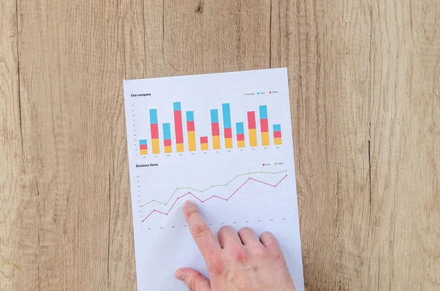
The article says support rose from 51 percent in 2025 to 55 percent in 2026. A bar chart begins at 45 percent, so the later bar appears more than twice as tall as the visible portion of the earlier bar. The caption says the survey "confirms growing public approval."
The story links to two summary releases but not the questionnaires or technical reports. It mentions each year's margin of error at the bottom without using those values to test the difference.
Stage 1: freeze the published record
An editor notices the problem during a routine chart review. Before changing anything, the team saves:
Freeze the published record
- the article, headline, deck, chart, caption, and alt text;
- the newsletter and social posts;
- both source releases and downloadable tables;
- the spreadsheet used for the calculation;
- publication and discovery times; and
- the names of the reporter, chart editor, and approving editor.
This record is not an exercise in blame. It prevents silent editing and lets the team identify every place the unsupported claim traveled.
Stage 2: rebuild the evidence table
The reporter obtains both methodology reports and questionnaires. The comparison table now looks like this:
Surveys differ in design
2025 survey
- Reported support
- 51%
- Margin of error
- +/- 4 points
- Sample
- 602
- Mode
- Telephone
- Population
- Registered voters
- Question
- General support
2026 survey
- Reported support
- 55%
- Margin of error
- +/- 5 points
- Sample
- 417
- Mode
- Online panel
- Population
- Adult residents
- Question
- Support after benefits
Rebuild the evidence table
2025 survey
- Reported support
- 51%
- Published margin of error
- +/- 4 points
- Unweighted sample
- 602
- Mode
- Telephone
- Target population
- Registered voters
- Question wording
- General redesign support
2026 survey
- Reported support
- 55%
- Published margin of error
- +/- 5 points
- Unweighted sample
- 417
- Mode
- Online panel
- Target population
- Adult residents
- Question wording
- Support after a short benefits description
The newsroom had compared different target populations, different collection modes, and differently framed questions. Those differences alone prevent the clean trend claim. Even if the surveys had been designed for direct comparison, their uncertainty would still need analysis.
The Census Bureau's Statistical Testing Tool shows the principle for survey estimates: test a difference using the estimates and their margins of error, not point values alone.
The tool is designed for American Community Survey data, so the Ledger does not use it as a calculator for this fictional poll. It adopts the supported verification principle and follows the pollster's own method.
Stage 3: test the numerical claim correctly
The pollster confirms that the published margins represent 95 percent confidence intervals and that the two samples are independent. For a training approximation, the newsroom converts each margin of error to a standard error by dividing by 1.96:
Test the numerical claim
| Quantity | Calculation | Result |
|---|---|---|
| 2025 standard error | 4 / 1.96 | 2.04 points |
| 2026 standard error | 5 / 1.96 | 2.55 points |
Difference fails significance test
- 1.22 | Test statistic
- 1.96 | 95 percent threshold
- 4 points | Observed difference
- 3.27 points | Standard error of difference
A two-sided 95 percent test would generally require an absolute test statistic near 1.96. The observed value, about 1.22, does not clear that threshold. The four-point difference is not statistically distinguishable under this approximation.
The exact procedure must match the survey design. Weighting, clustering, overlap between samples, repeated respondents, and design effects can change the standard error. The team therefore asks the pollster to reproduce the comparison before publishing replacement language.
Stage 4: decide what can still be said
The evidence supports two separate descriptive statements:
Decide what can still be said
- In the 2025 telephone survey of registered voters, 51 percent selected the listed support response.
- In the 2026 online survey of adult residents, 55 percent selected support after reading a benefits description.
It does not support "support rose" because the instruments do not measure the same population under the same conditions. It also does not support "surged," which adds an unsupported judgment about scale.
The Census Bureau's margin-of-error FAQ says analysts should consider margins of error when comparing estimates and use a statistical test for reported comparisons. Again, the page concerns ACS estimates, not this fictional city poll. Its relevance is the reporting discipline: point estimates and uncertainty travel together.
Stage 5: repair the chart
The team withdraws the two-bar trend chart. A zero baseline would fix the visual exaggeration but not the invalid comparison. Adding error bars would show uncertainty but still place unlike measures in a trend frame.
Chart replaced by table
Before
- Format
- Two-bar trend chart
- Baseline
- Starts at 45%
- Comparison
- Implied change over time
- Note
- Confirms growing approval
After
- Format
- Two-row table
- Baseline
- Not applicable
- Comparison
- Separate survey descriptions
- Note
- Do not interpret as change
The replacement is a two-row table. Each row names the year, estimate, margin of error, target population, mode, and abbreviated question. A note states that the results should not be interpreted as a change over time.
This decision follows a useful rule: a visually honest chart cannot rescue a conceptually invalid comparison. Sometimes the correct chart repair is removal.
Stage 6: write the correction
The Ledger places this notice at the top of the article:
Correction, July 28, 2027: An earlier version said support for Harbor City's bus redesign rose from 51 percent in 2025 to 55 percent in 2026. The surveys used different target populations, collection modes, and question wording, so they do not establish a change over time. The four-point difference also was not statistically distinguishable using the reported margins of error and the pollster's comparison method. We replaced the trend chart with a table that describes each survey separately and changed the headline, caption, and related social posts.
The corrected headline reads:
New survey finds 55 percent support after respondents read bus-plan summary
That wording identifies the new result without turning it into a trend or omitting the question context.
Stage 7: update every distribution surface
The production editor works through a written inventory:
Update every distribution surface
- article headline, deck, body, chart, caption, alt text, and metadata;
- homepage and section-page cards;
- mobile and syndicated versions;
- newsletter subject line and archive;
- social posts and attached images; and
- data download and chart source file.
Where editing is impossible, the newsroom replies or republishes with a direct correction. The archived original remains available internally for accountability.
Stage 8: change the workflow
The review finds three control failures. The spreadsheet included margins of error but no comparison test. The chart checklist checked its labels but not comparability. The editor saw two official-looking releases and did not request the questionnaires.
The newsroom adds four controls:
New survey controls
- Survey trend includes comparability table
- Estimate comparison shows producer-approved test
- Poll charts list population, mode, sample, dates, wording
- Correction inventory covers every distribution surface
These controls address the route by which the claim failed. A generic reminder to "be careful with polls" would not.
The corrected evidence record
| Original statement | Finding | Final action |
|---|---|---|
| Support surged four points | Different designs and no supported trend | Remove trend language |
| Surveys confirm growing approval | Point values do not establish growth | Describe each survey separately |
| Truncated two-bar chart | Exaggerated and conceptually invalid | Replace with annotated table |
| Margin of error in footer only | Uncertainty omitted from inference | Add comparison method and result |
| Social card repeats surge claim | Distributed error remains public | Correct post and replace image |
Common questions
Could the true support level still have increased?
Yes. The correction says these surveys do not establish that increase. It does not claim that no change occurred.
Why not keep the chart with a disclaimer?
The two measures are not a valid trend series. A disclaimer would ask the graphic to communicate a comparison the evidence cannot sustain.
Does a nonsignificant difference prove the values are equal?
No. It means the available evidence does not distinguish the reported difference under the stated test and assumptions.
Should the newsroom mention its calculation in the public correction?
Yes, when the calculation changes the conclusion. The notice can stay concise while the article or methodology note carries the details.